Introduction
Empathise
Define
Ideate
Prototype
Develop
Results
Workflow

I usually use the D.School iterative UX method.

Empathise
Stakeholder interview
Secondary Research
User Interview
Define
Affinity map
POV
User personae
Ideate
HMW
User Map
MVP
Site map
Prototype
Sketching
Wireframe
UI Design
High fidelity
Test
Develop
Develop
Responsiveness
Test
Develop
Problem Statement

Outdated design and poor usability

My first step in the project was a test and study of the old website of the company to determine the usability and experience problem.

Old Belcam site:

Communication and involvement with clients

Owners didn't had easy access to information or communication channels

Lack of trust

The old UI destroyed the clients first impression causing a lack of trust in the company.

Poor UI/UX Design

Empathise
Empathising with the user
Once you see the darkness around, the light arises.
Stakeholder Research

I had a conversation with every member of the team.

By interviewing the company team I discovered internal company insights and needs. Based on this I added features to the product. To be on the same page it is essential to profoundly understand and share the project with your client or stakeholders.

Research Focus:

1. Future Goals

2. Service procedures

3. Experiences with users

4. Values

5. Frustrations

Discoveries:

1. Reputation is everything

2. More than 90% of the clients come via recommendation

3. They are usually saturated with calls and reports

4. They have become friendly with many clients

Click to see the detailed report
Secondary Research

General research to understand the market and environment

Looking around you can bring inspiration, perspective and relevance.

Research Focus:

1. Competition

2. Marbella housing enviromen

3. Property management procedures

Discoveries:

1. More than 60% of the housing in Marbella is for holidays

2. Websites have small impact on property management conversions

3. Marbella is full of foreigners and "lifestyle" atmosphere

Qualitative research

10 minute talks to empathise with users

To create the most accurate website I needed to understand the point of view, needs and frustrations of the users. So, I conducted a series of qualitative research interviews.

Interview Focus:

1. Practices

2. Experiences

3. Communication

4. Good Managerial Qualities

Interview
Semi-structured
Participants (3 people)
Owners & presidents (40-60 years old)
Data and Analysis
Audio Recording,Transcriptions
Click to view the detailed plan and scipt document

Users have had a lot of problems dealing with managers

After reading the interview transcriptions and analyzing the data through word codes, I extracted these insights from the users opinions.

Users insights:

1. Users usually feel a lack of transparency from property managers, due to the absence of direct contracts.

2. For users, the main point when comparing property managers is reputation and merit.

3. Usually owners don’t vote for a change of property manager (unless the manager had not fulfilled what was expected)

4. Owners need a property manager to have great legal knowledge, in order to solve problems

5. Users need communication with their property manager to be as quick and fluent as possible

Click to view the detailed research report
Defining
Defining the problem
On a white board everything looks clear.
Affinity map

I clustered all the ideas and user quotes into groups to get an insight on the data

I extracted all the ideas and codes from the interview transcription, to understand the data and discover patterns and the importance of the ideas.

Final Clusters:

1.Communication with the property manager

2.Practice and experiences

3.Good admin Qualities

4.Needs or desired improvements

POVS

I put myself into the user's and stakeholder's shoes to understand their POVs

This exercise was useful to explore perspectives and think out of the "designer's box".

Stakeholder P.O.V
User P.O.V
User Personae

Personae creation allowed me to define and understand users

Stakeholder Persona

This deliverable allowed me to empathise with stakeholders, wich made me conscious of how to help them in their day to day job with the webpage.

User Persona

This exercise was useful to empathise with users, explore new perspectives and think out of the designer's box.

New approach to problems

Before understanding the problem I thought of a selling site, after I opted for a more client service oriented site.

At the start of the Project I was supposed to design a website focused on client acquisition and conversions, but through my discoveries  I decided to focus the website on cultivating the company trusworthiness and improving customer attention. That way the clients will come by themselves.

Ideation
Ideation
One idea lights a thousand candles
HMW

How might we help customers and stakeholders optimize community management?

A useful method to start the ideation journey, I especially enjoyed using it. It helped me ideate and order new features for the website that I had in my mind.

HMW Questions

User Map

Understanding the users' processes is essential in order to develop your own.

From the discovery of the service to the goal action, each step was crucial for my understanding. I also mixed the HMW questions with the user map, and applied this rule: Where more questions are in place more focus is needed.

User Map

MVP

I started ideating the features to supply users and stakeholders needs and I classified them

I classified the features by level of importance, in order to know what to develop first. I also ordered the features by screens in a web-map style.

Needs VS Features

An explanatory list of why I ideated the most important features.

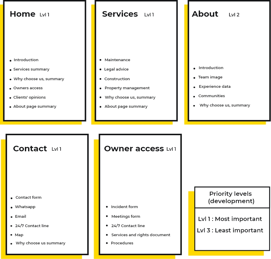
Web map

Website structure, order and flow

The website is a purely inspirational one mixed with some extra functionalities for clients.

Client Feedback 1

I presented the clients with the research results and the features, and it went exceptionally well

I explained the insights extracted from the research and the ideas I came up with to the client . The result of that meeting was excellent, the client was happy, accepting almost all my recommended features, but others were difficult to apply due to their timing and workflows.

Prototyping
Prototyping
Conversing with Ideas
Sketching

I created paper sketches of the website

Sketching helped me to previsualize and ideate the web layout in an easy and quick way.

Wireframing

Taking the sketches as a reference, I created the wireframes following a minimal design style

The next step was create the wireframes, which allowed me to visualize and create the skeleton of the website.

Client Feedback 2

I presented the wireframes and flows to the clients before going deeper into the UI design

The clients loved the minimal aproach and I was ready to continue.

UI Design

Following the research bases I created the UI with an inspirational and minimal  style

I used an inspirational style in the images ,colours and layouts for two main reasons: 1. To differentiate Belcam from the competition, and 2. Because the housing enviroment in Marbella flows around a luxury and "coolish" environment.

Moodboard

Inspiration

UI Styleguide

I created the UI Styleguide to base my design on it

High Fidelity prototype

I created the high-fidelity prototypes to have the client's feedback before the development

Incident Form
Finally we applyed the incident form, in less than 1 minute in the page the owner can report a incident
Incident Form
Finally we applyed the incident form, in less than 1 minute in the page the owner can report a incident
Incident Form
Finally we applyed the incident form, in less than 1 minute in the page the owner can report a incident
Incident Form
Finally we applyed the incident form, in less than 1 minute in the page the owner can report a incident

8.Close the door

Lorem ipsum dolor sit amet, consectetur adipiscing elit. Suspendisse dolor turpis, dictum a efficitur in, aliquam eget velit. Sed efficitur eget risus nec tristique.

1. Login

Lorem ipsum dolor sit amet, consectetur adipiscing elit. Suspendisse dolor turpis, dictum a efficitur in, aliquam eget velit. Sed efficitur eget risus nec tristique.

2. Garage Map

Lorem ipsum dolor sit amet, consectetur adipiscing elit. Suspendisse dolor turpis, dictum a efficitur in, aliquam eget velit. Sed efficitur eget risus nec tristique.

3. Pick a garage

Lorem ipsum dolor sit amet, consectetur adipiscing elit. Suspendisse dolor turpis, dictum a efficitur in, aliquam eget velit. Sed efficitur eget risus nec tristique.

4. Scan the Qr

Lorem ipsum dolor sit amet, consectetur adipiscing elit. Suspendisse dolor turpis, dictum a efficitur in, aliquam eget velit. Sed efficitur eget risus nec tristique.

5. Payment & Confirmation

Lorem ipsum dolor sit amet, consectetur adipiscing elit. Suspendisse dolor turpis, dictum a efficitur in, aliquam eget velit. Sed efficitur eget risus nec tristique.

6. Open the door

Lorem ipsum dolor sit amet, consectetur adipiscing elit. Suspendisse dolor turpis, dictum a efficitur in, aliquam eget velit. Sed efficitur eget risus nec tristique.

7. Park

Lorem ipsum dolor sit amet, consectetur adipiscing elit. Suspendisse dolor turpis, dictum a efficitur in, aliquam eget velit. Sed efficitur eget risus nec tristique.
Client feedback 3

I presented the high-fidelity prototypes to the clients in order to obtain feedback and pivot the design.

The clients were happy with the prototype, but they needed some texts and images changes.

Development
Development
From design to code
Webflow layouts

I replicated the design on Webflow, and created responsive HTML layouts

I added transitions, animations and functionalitties to the design using Webflow and CSS code.

Feedback gathering

After the launching, the user experience will be revised based on the data from google analytics.

For me is crucial gathering feedback from my clients websites and use it to improve the user experience.

TOP Launching Features

1. Navigation bar shortcuts

I created a navigation bar that have shortcuts to the two most demanded features by owners and new clients: Community incident report and Online Budgeting.

2. Incident form

I created a simple but useful form using typeform to make it easy for owners to report an incident and for managers to gather data.

3. Commitment and services Document

To build trust in the company and create a commitment with customers I added an option to download a document where all services and company commitments were placed.

4. Book a consulting session

To be closer to customers and improve the communication with the company I designed a feature based on an embed google calendar to book a date in the office.

Check the live site
Learnings

The take away: Even the most basic website will dramatically improve its UX with a proper UX approach and methodology.

At first, this project didn't seemed challenging, my fist assumption was that using the UX methodology for a corporative site could be worthless. But by empathising with the users and diving into their pains I discovered a whole new world of possibilities wich could improve customers and stakeholders lifes.