My Role: UX Designer
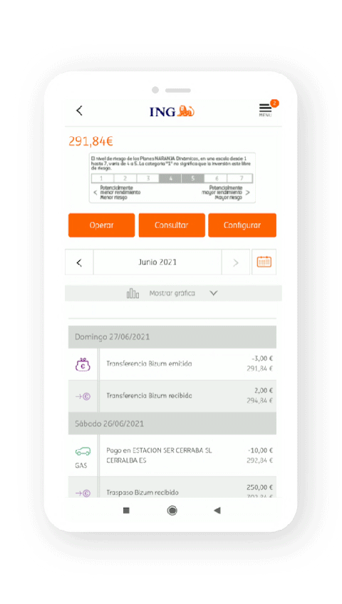
After using the app multiple times, I faced a lot of trouble navigating through it. I couldn't customize the app, the layout and UI were outdated, I couldn't look for specific banking data to make an accurate statement about my accounts and basically the experience in general wasn't good.

Through the design, I identified clear usability issues and pain points, which I listed in order to validate it with users.


I conducted telephonic and in-person interviews.

After analyzing this data I searched for other sources of information to understand the differences between the use of banking apps in the US and Spain to understand which pieces of information I could base my design on and which ones I couldn't.
"I couldn't find anything, years ago ING had a simple but effective website sorted by simple foldouts where you could find whatever you needed, but now it is impossible to find it on the app"
"One of the thing I consult the most are the charts and graphics about my movements but in the ING app I feel that they are not as useful as in other apps that I use"
"When I wan't to do something out of my usual operations I usually I have to call the bank to get this done, becouse I cant find what I need"


.gif)


This gave me perspective over my own designs, helping me improve them and be more critic with the results.


